Sarge Potteiger
Emotional Damage


ur in the past
also, it doesn't allow me to click my notifications or anything.
also, it doesn't allow me to click my notifications or anything.
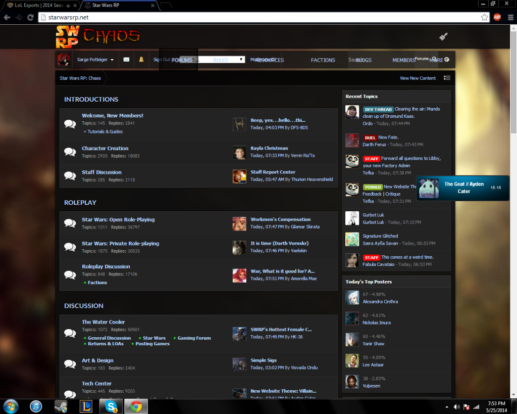
It's intentional.Ilias Nytrau said:The only thing I would say is that the backgrounds seem blurry, but if that's intentional, then I am okay with that.
I too, have this issue. The menu bar overlaps my character switch bar and whatnot. I had to stop using that theme because I couldn't switch between accounts.Sarge Potteiger said:Got this weird thing where the 'forums/rules' bar overlaps my 'messages/sign out' bar
")
Amorella Mae said:I too, have this issue. The menu bar overlaps my character switch bar and whatnot. I had to stop using that theme because I couldn't switch between accounts.
Adenn Gra'tua said:I like the theme, but I still like the underworld one better... Might change a few chars to it though.
EDIT: after finally checking out the RIGHT theme this time, I realized that it feels to much like a what a RP site would look like on a computer, which I don't like, as it is nice, crisp and clean, it isn't for me.