Register a free account today to become a member! Once signed in, you'll be able to participate on this site by adding your own topics and posts, as well as connect with other members through your own private inbox!
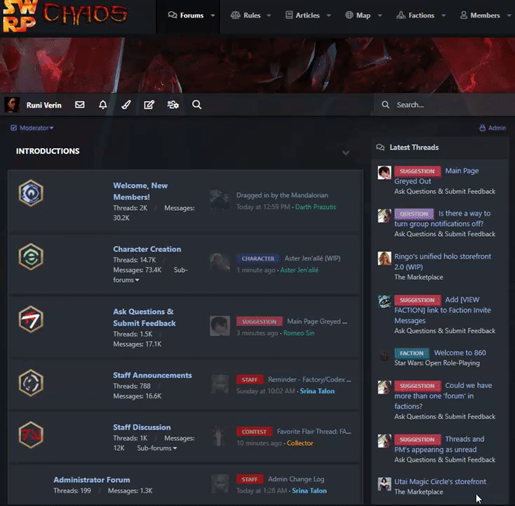
So as the title suggests, all the regular names are a grey ontop of a grey which is hard to read, while the pictures are all greyyed (Im aware not a word) out. Anyway this could be fixed?
I think he's suggesting that the current theme is too low contrast, that link colors + background colors are too similar and can be difficult to read on certain screens or with certain eyes.
That, and its confusing with the lowered opacity of the images. Makes it seem like I've already read these threads or something. Specially when I go into say Public or Character Creation and all the images are normal colors. The transition between the main page and the threads is just....OOF lol but if no one else feels the same then I will adapt.
I like the reduced opacity on avatars (I'd love that everywhere except in thread views, tbh!) but the reduced opacity on thread titles is problematic for me as well.


")