
A brilliant fire


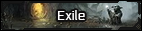
I've seen a lot of the new characters being posted making use of the new templates, which is cool! But when I look at the ones with the dark backgrounds, I find the text really straining on the eyes. I started experimenting with the code, and I think it's primarily the text-shadow that's doing this for me (though the standard font in addition doesn't help either maybe). It makes the text feel a little bit blurry, and makes me personally look away quickly.
I don't know if this is just me or if others feel the same way, so I figured I'd make this and get a better feel on it. I've added two examples with and without the code down below, but I also suggest just looking at the newly made bio's and gauging how you feel about it. Maybe it's not an "issue", but maybe it is to more people. And if it is, I don't think we should leave it up to new members to make edits to divs, and make the template itself as easy on the eyes as we can.
With text-shadow:

Without

I don't know if this is just me or if others feel the same way, so I figured I'd make this and get a better feel on it. I've added two examples with and without the code down below, but I also suggest just looking at the newly made bio's and gauging how you feel about it. Maybe it's not an "issue", but maybe it is to more people. And if it is, I don't think we should leave it up to new members to make edits to divs, and make the template itself as easy on the eyes as we can.
With text-shadow:
Without


")