Star Wars Roleplay: Chaos

Register a free account today to become a member! Once signed in, you'll be able to participate on this site by adding your own topics and posts, as well as connect with other members through your own private inbox!

New Light Theme : Cubic - Lights On

PRESENTING CUBIC - LIGHTS ON

hc6q.jpg


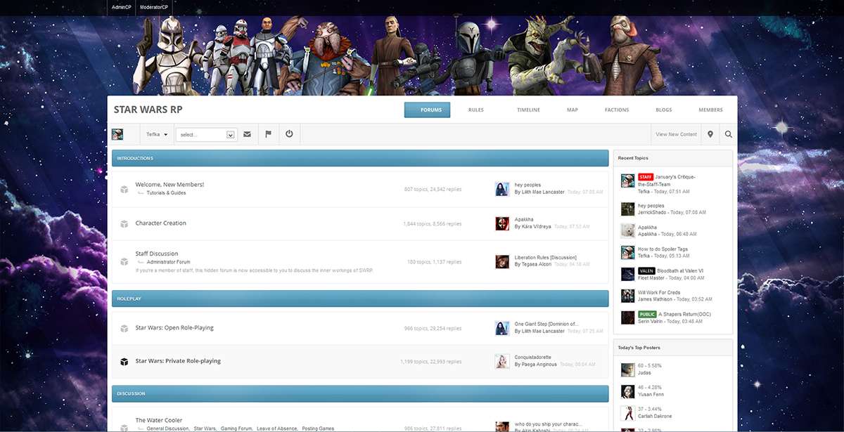
Cubic - Lights On is a new website theme for SWRP created to improve website stability and productivity, while also bringing about the first "white" theme to Star Wars RP.

THIS THEME IS CURRENTLY TO BE CONSIDERED IN IT'S ALPHA STAGE. You may encounter discrepancies, though few, when using this theme. Please report them in the Bugs & Errors forum, located here. Screenshots are preferred but not entirely necessary!

This will be a part of a large push to change the entire design of SWRP. A dark theme is coming, and will be considered the main replacement for the default theme of SWRP.

TO CHANGE YOUR THEME:

>Go to the bottom of the website, look on the left for "Change Theme".
>Click "Change Theme."
>Select "Cubic - Lights On" at the bottom.
 
Found a small issue Tefster. While it should be fine on my usual laptop, I'm on a smaller-resolution laptop at present and it's massively overscaled width wise.

Also what Lilith said, a few aesthetic issues, but that's not a technical issue :p
 

Carn Dista

Guest
C
Ech, I definitely don't like this. It's a little bit garish in honesty - although it is good for people who need more contrast to be able to see things. Personally I won't be using this skin because, well, in honesty the Heroes skin is much better, and I've never liked the idea of cartoon CGI starwars characters. - Although I do like the way they blend into the background.
 
Well, I am going to use the Heroes theme until the darker one come out. It's a bit too different from the other ones. And also... I miss the forum's header there... :D Normally, when I want to refresh for new posts, I click on the header, not on the refresh button in my browser. I'm using a desktop and it's a bit too... well, the resolution is not very good for this computer I am using at the moment. Though I like it. Just some things I found after my previous post...
 

Flint Dexen

Wandering Lost Soul
New theme looks pretty cool, but I plan on sticking with the default theme. White is a drastic difference compared to the dark background that I am so used to on this site, so I'd rather stick with the one I'm used to.
 

Users who are viewing this thread

Top Bottom